

Brand Refresh & Imagery
case study
Maruia Hot Springs
Brief
Maruia Hot Springs had recently completed extensive renovations across its hot pools, accommodation, and restaurant, however the existing brand no longer reflected the experience on offer. The brand felt dated and was tied to a perception of low quality, reinforced by outdated, pre renovation imagery.
The brief was to refresh the brand and create new imagery that accurately positioned Maruia Hot Springs as a premium, natural hot springs experience. While the logo needed to remain, it required refinement, and the wider brand was open to reimagining. It was also important that the refreshed brand worked cohesively alongside sister brand Peninsula Hot Springs in Melbourne.
Delivery
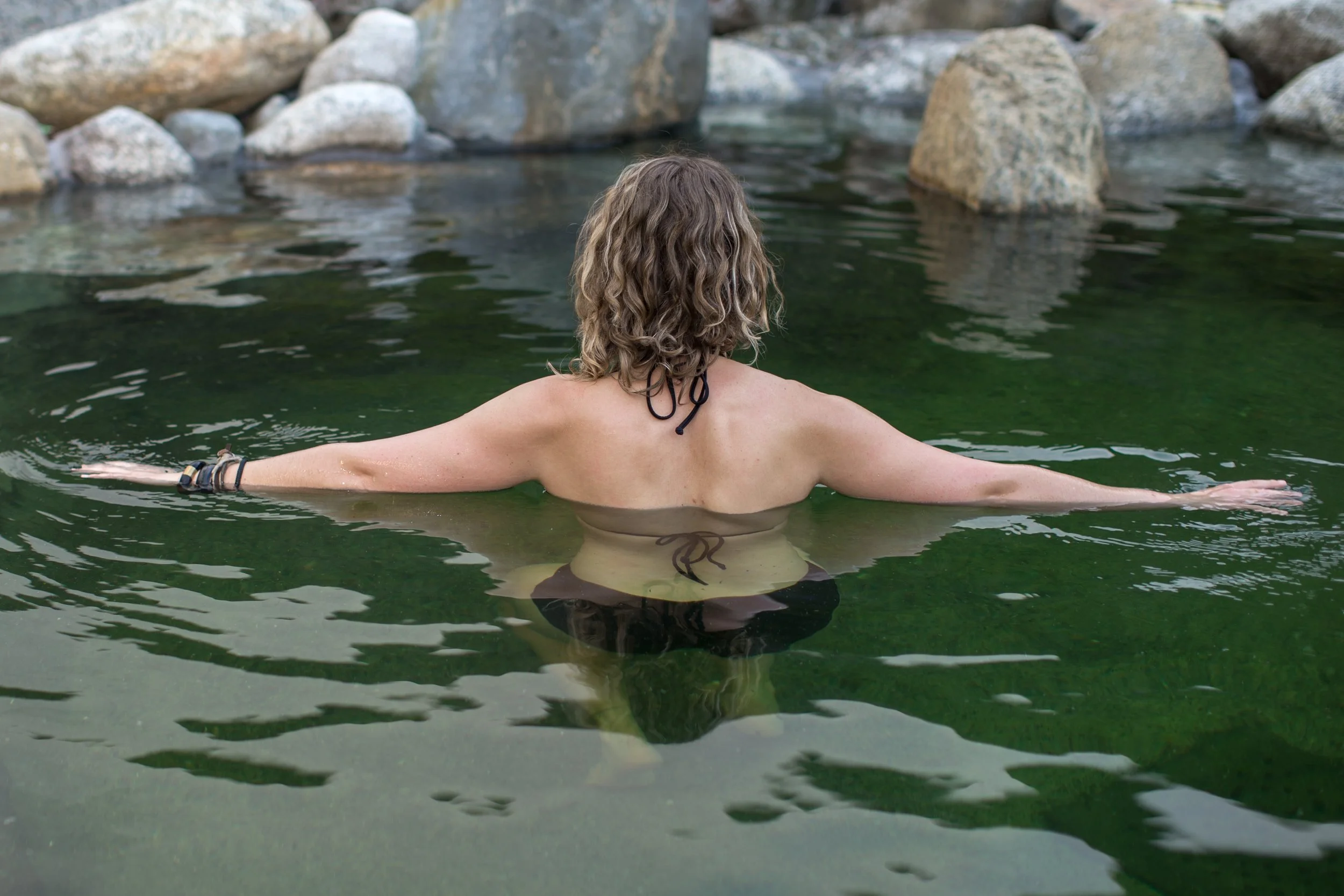
To truly understand the Maruia Hot Springs experience, we spent time onsite immersing ourselves in the environment and the guest journey. Experiencing the setting firsthand allowed us to capture the essence of the location, the feeling of being surrounded by nature, and the sense of escape that defined a stay at Maruia.
Imagery played a key role in the rebrand. Rather than focusing solely on landscapes, we captured people within the experience to communicate total immersion and sell the feeling of staying at Maruia Hot Springs.
We worked closely with the Peninsula Hot Springs team throughout the process to ensure both brands felt connected, while still allowing Maruia Hot Springs to stand confidently in its own right.
Outcome
The refreshed brand, guidelines and imagery repositioned Maruia Hot Springs as a luxury, nature led destination. The new visual identity accurately reflected the post renovation experience and worked cohesively with the Peninsula Hot Springs brand, clearly expressing the relationship between the two while elevating Maruia Hot Springs in the market.